Book covers are much on my mind as I work with a graphic artist to create my own cover. I have always been of the “less is more” design camp, but that may be hard to do while branding the book as science fiction.
Why do publishers think that book covers that are busy, at best, or garish, at worst, sell science fiction books? I have been a science fiction buff since high school, but I was always vaguely embarrassed to actually be seen reading books from the genre. Oddly enough, I am drawn to science fiction because of the science. A good science fiction author takes the science and molds it into a “what if” scenario that stretches the facts just a bit, or a lot, further. I look for the reality shift when I suddenly see the story in a totally different light—the “ahha” moment. Beyond engaging my imagination, this kind of recreational reading helps to spur creative thinking.
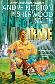 I recently became aware of the parody site Good Show Sir: Only the Worst Sci-fi/Fantasy book covers. For example, the comment posted with the cover for A Mind for Trade, by Andre Norton and Sherwood Smith: “Sing with me, little one! ’I-I-I’m a lumberjack and I’m okaaaay…’” Funny, yes, but I think the man's pose may be the least of the problems with this particular book cover.
 Either I am an unusual science fiction buff, or publishers have it all wrong as they compete to put the most sensational attention-grabbers on a cover, whether or not it reflects the story. I recently read a blog illustrating the point. In Of Covers and Frustrations, author Jane Fancher is talking about the cover for one of her hard science fiction books.
I wanted a computerchip background theme running through all three covers. For the first book, I wanted the foreground to be the Miakoda Moonrise…a double moonrise over an alien landscape that is a key moment in the book with one or more of the characters in the image. Barclay gave me a lovely computer chip…which the art department completely covered with type. A double moon, the smaller of which the art department completely obscured with my name, thus eliminating the “alien”. And a secondary female character beside a fire because statistics said female figures sell.
Not even the covers on a notable book like Stranger in a Strange Land, by Robert A. Heinlein, escape re-imagining. I must admit that the 1973 printing may be an illustration of a case where less is not more.
 |
| Current |
 |
| 1961 |
 |
| 1973 |
(As an aside, I came across a mesmerizing infinity animated gif, called Moving Water, while searching for the above cover images.)
What makes a good science fiction book cover? Do book covers influence your reading decisions?
What makes a good science fiction book cover? Do book covers influence your reading decisions?
No comments:
Post a Comment